Calligraphy for beginners: how to actually start.
Calligraphy is one of the oldest deliberate crafts still practiced today, and one of the more approachable ones to begin. This guide covers what the word actually means, how it differs from hand lettering, the main script styles, and the honest, unglamorous path from a blank page to your first clean alphabet.
Calligraphy is the art of fine, deliberate handwriting, from the Greek for beautiful writing. Unlike hand lettering, where letters are drawn and filled in, calligraphy letters are written stroke by stroke, following the rules of a chosen script. Starting needs only three things: a writing tool with real stroke character, ink, and smooth guide-ruled paper, plus about fifteen minutes of practice a day.
What calligraphy actually is.
Calligraphy is the art of beautiful handwriting: letters aren't just put down to be read, they're deliberately shaped, weighted and composed according to the visual rules of a chosen script. The word comes from Greek, kallos for beauty and graphein for to write.
The difference from everyday handwriting is one of intent. A quick note aims to carry information. Calligraphy aims to compose: every letter follows the form rules of its script, and the stroke's width shifts on purpose, shaped by the tool and the hand guiding it.
It's worth saying clearly: calligraphy is not a Western invention. Arabic and East Asian calligraphy are older, equally rich, and in some traditions more highly regarded than any script covered here. In Chinese culture especially, calligraphy has stood for centuries as one of the highest art forms, not a craft on the side.
Calligraphy vs. hand lettering vs. typography.
Three terms get used almost interchangeably, and the difference is straightforward once you look at the technique instead of the result:
| Discipline | Technique | Typical tool |
|---|---|---|
| Calligraphy | Letters are written, stroke by stroke, following a script's rules | Broad-edged or pointed dip nib, fountain pen, brush |
| Hand lettering | Letters are drawn, sketched, constructed, then filled in | Pencil, fineliner, brush pen |
| Typography | Letters are set, existing typefaces chosen and arranged | Design software, historically metal type |
In practice these overlap constantly: plenty of hand letterers use calligraphic forms as a reference, and modern calligraphy allows freedoms classical schools never would have. As a starting rule of thumb, though: if you want to write, learn calligraphy. If you want to draw and compose, start with hand lettering.
The main script families.
There is no single calligraphy script, historically thousands of forms have existed. For orientation, four families cover almost every beginner worksheet you'll find:
| Family | Character | Typical tool | Beginner-friendly? |
|---|---|---|---|
| Blackletter (Gothic, Fraktur) | Angular, dense, medieval | Broad-edged dip nib | Good: clear, rule-based construction |
| Foundational hands | Rounded, calm, highly legible | Broad-edged dip nib | Excellent: the classic starting point |
| Pointed-pen scripts (Copperplate, Spencerian) | Elegant, flowing, fine hairlines | Flexible pointed nib | Demanding: needs real pressure control |
| Modern calligraphy | Free, expressive, intentionally uneven | Pointed nib or brush pen | Good: forgives inconsistency |
The style you choose decides your tool and your practice path, which is exactly why it comes first: pick the style, then buy the materials, not the other way around.
Brush pens deserve their own mention, since they're a common way into calligraphy. A brush pen has a flexible tip, felt or fiber, that responds directly to pressure: press harder on a downstroke and it flares into a thick line, ease off on the upstroke and it springs back thin, the same principle a pointed dip nib runs on. It's far more forgiving of an unsteady hand, and inexpensive enough to try without commitment. It's the usual tool for modern brush lettering.
Paper still matters with a brush pen. Rough or textured stock frays the tip quickly and shortens its life, so look for smooth paper the same way you would for a dip nib or fountain pen. A small or fine tip is also easier to control when you're starting out than a large one, which makes it easy to produce bold, sweeping strokes before your hand is ready.
How to learn it, step by step.
Every calligraphy technique creates its thick-and-thin contrast in one of two ways. With a pressure-based tool, a flexible pointed nib or a brush pen, you write upstrokes light and thin and press harder on downstrokes to make them thick, the contrast lives in your hand. With a broad-edged nib, held at a steady angle to the baseline, the contrast happens automatically as the pen moves in different directions. Once you know which mechanism you're working with, the drills below make more sense.
Calligraphy is entirely learnable on your own, largely through the same medium that pushed handwriting aside in the first place: the internet offers tutorials, guide sheets and full courses, many of them free. The path itself almost always follows the same five steps:
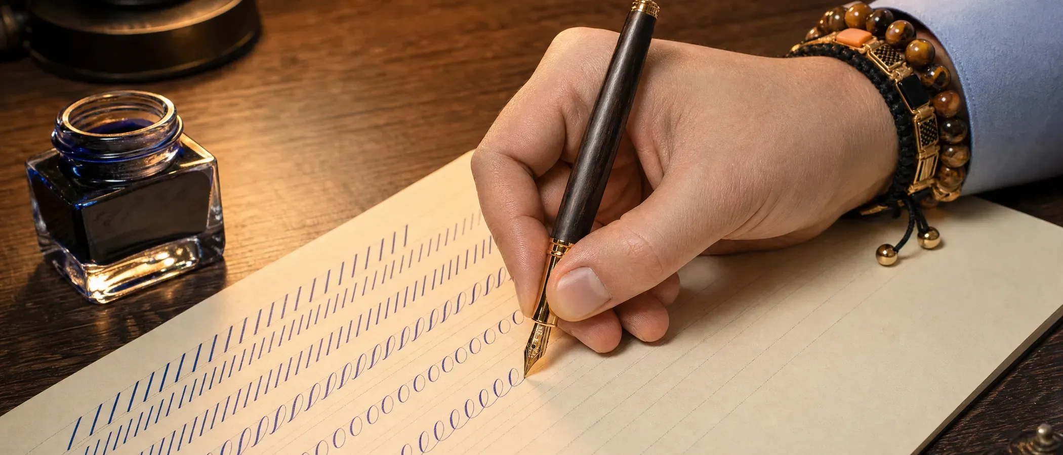
- Loosen up your handwriting. Simple warm-up strokes get a keyboard-stiffened hand moving freely again, usually within a few days. The classic sequence: entrance and exit strokes, underturns and overturns, compound curves, ovals, then ascending and descending loops, each repeated in rows before you move on to whole letters.
- Choose one style. Exactly one. A calm foundational hand or modern calligraphy are the most forgiving starting points. Splitting attention across three styles at once teaches you none of them well.
- Practice with guide sheets. Ruled worksheets set the height, angle and spacing for you, the same way lined paper did in grade school. Work letter by letter, not word by word.
- Repeat until it's automatic. A single letter is worth writing twenty times if that's what it takes. Regularity beats volume: fifteen minutes daily moves you further than two hours once a week.
- Take on small finished pieces. A birthday card, a name tag, a short quote. A small finished piece motivates far more than an endless stack of drill sheets.
A single letter is worth writing twenty times if that's what it takes. In this craft, patience outperforms talent.Aus der Praxis · Andre Hörner
For context: clean, simple letters typically appear after a few weeks of daily practice, a genuinely even hand takes months. That's normal, not slow, monastery scribes trained for years before they were trusted with an important manuscript.
What you actually need.
The honest answer first: dedicated calligraphy nibs, holders and specialty inks are their own specialist field, and you won't find a broad-edged dip nib in our catalog, that's genuinely a different supplier's territory. For getting started, three things matter:
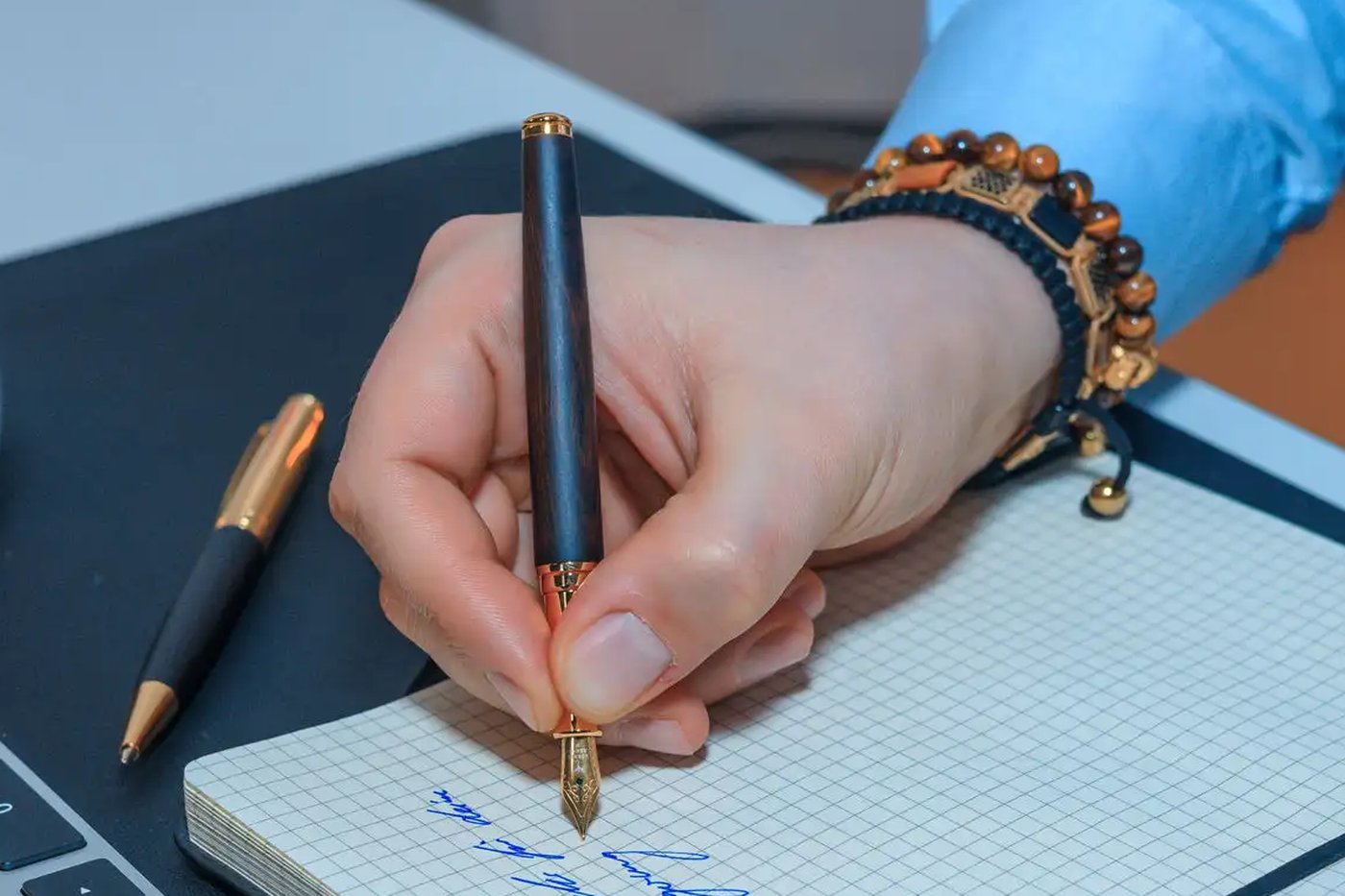
- A writing tool with real stroke character. For blackletter and foundational scripts, a broad-edged dip nib (roughly 1 to 3mm) and holder. For pointed-pen scripts, a flexible pointed nib. If you'd rather not dip at all, a fountain pen with a stub or italic nib gives real thick-and-thin contrast, while a regular round nib is best for practicing letter shapes; our guide to fountain pen nib sizes covers exactly what each grade does, and which of our pens ship with which.
- Ink or dedicated calligraphy ink. Dip nibs handle dense, pigmented calligraphy ink well. A fountain pen, on the other hand, needs proper fountain pen ink exclusively, anything thicker will clog the feed. A converter lets a cartridge pen draw straight from a bottle instead.
- Smooth, ruled paper. Standard printer paper feathers under wet ink. Look for smoother paper, roughly 24lb and up, with printed guide sheets for practice.
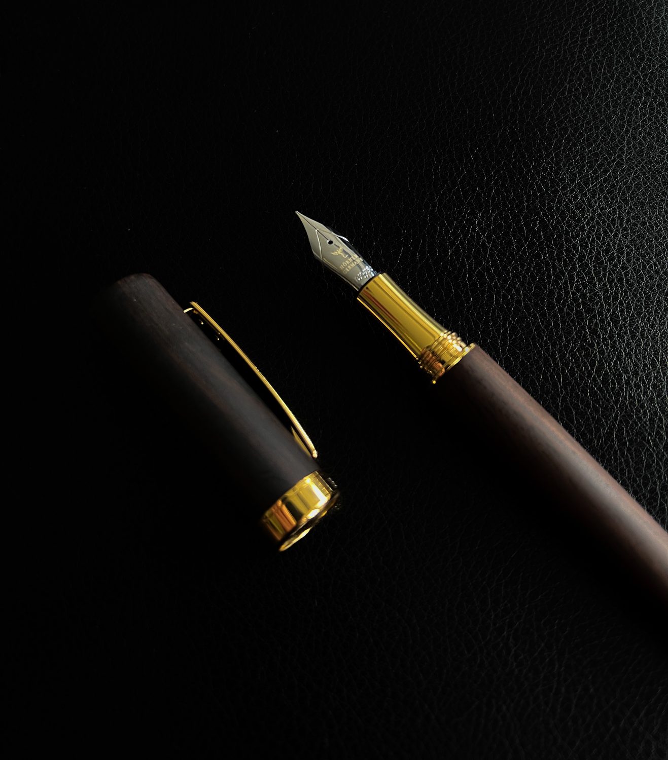
Buy for exactly one style, not the biggest set on the shelf. One nib, one bottle of ink, one pad of guide paper gets you started for well under $30. If you'd rather skip dipping entirely, start with a fountain pen carrying a medium or broader nib, our Legno is a straightforward place to begin, and move to dedicated dip nibs later if a pointed-pen script pulls you in.
One more thing before you spend anything: you can try the effect for free with faux calligraphy. Write a word in your ordinary cursive with any pen or even a pencil, then go back and draw a second line just beside every downstroke and fill in the sliver of space between the two lines. The result mimics real calligraphy's thick-and-thin contrast without any special tool at all, and it teaches your eye exactly where the thick strokes belong before you try to produce that contrast live with a pressure-sensitive nib or pen. It works just as well with a fountain pen, so it's a good way to test the letter shapes with a pen you already own.
Why it is worth the patience.
That leaves the real question: why put in the effort to hand-form what any font can set in a second? The answer sits in the effort itself. Calligraphy demands something that's grown rare, full attention on one slow, deliberate motion. Write the same letter for the twentieth time and there's genuinely no room left to think about anything else. Many people describe the state that produces as close to meditative, the same way music or painting can be.
Then there's the result. A hand-lettered card, a carefully addressed envelope, a certificate in a clean, considered hand, all of it visibly carries more attention than anything printed, and the person receiving it feels that difference. If calligraphy leads you toward more handwriting generally, our guide on designing a better signature covers the more everyday side of the same skill, and what makes a good fountain pen is worth a read before choosing your next writing tool.